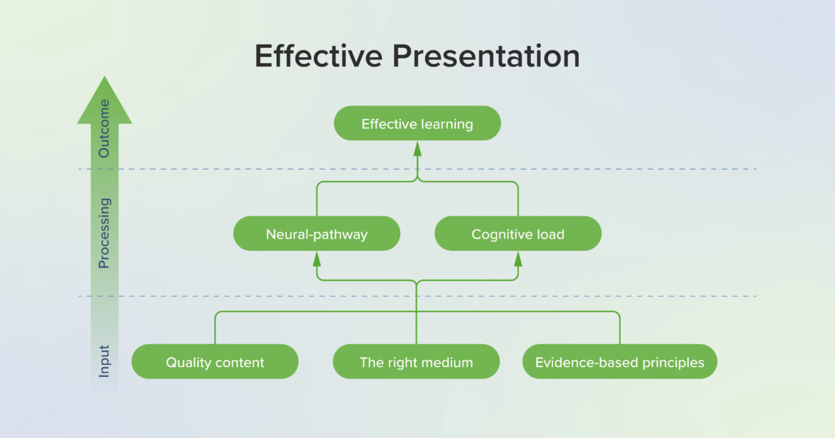
What is an effective presentation?
Professional education requires presentations, from a small discussion or a short video to speaking to a lecture hall with an audience of hundreds. In fact, presentations are at the core of the educational process. With the effort to view all our educational efforts through an evidence-based lens, the construction of an effective presentation needs to undergo the same scrutiny. Whether a presenter intends to share plans, teach educational information, give updates on project progress, or convey the results of research, the extent to which the audience understands and remembers the presentation relies not only on the quality of the content but also the manner in which that content is presented. While the medium of the presentation may range from written content to graphics, videos, live presentations, or any combination of these and more, each of these mediums can be enhanced and made more effective by the use of evidence-based practices for presenting. Regardless of the medium, effective presentations have the same key features: they are appealing, engaging, informative, and concise. Effective presentations gain attention and captivate the audience, but most importantly, they convey information and ideas memorably.
With the integration of technology and online learning, educators have more opportunities than ever to present rich content that enhances and supports student learning. However, these opportunities can be intimidating to educators striving to engage students, as it can be daunting to create visually appealing and informative materials. Additionally, many educators feel pressured by the continued myth of learning styles: the widespread misconception that learning materials should match students’ visual, auditory, or kinesthetic “styles” to optimize learning (1). Despite being featured in many articles and discussions, there is no compelling evidence that matching educational content to learner’s style preferences increases educational outcomes. However, using multiple modes of delivery such as visuals, audio, and active learning has been shown to benefit all learners. In other words, no matter their stated preference, all learners benefit from a variety of media. Using evidence-based principles for multimedia content such as the principles found in Richard Mayer’s multimedia learning as well as the principles of graphic design and universal design supports learning and increases educational outcomes.
Why effective presentations work
What makes a presentation effective? Is an appealing and engaging presentation also an effective one? Research from cognitive science provides a foundation for understanding how verbal and pictorial information are processed by the learner’s mind during a presentation.
Mayer’s cognitive theory of multimedia learning
Based in cognitive science research, Mayer’s evidence-based approach to multimedia and cognition has greatly influenced both instructional design and the learning sciences. Mayer’s cognitive theory of multimedia learning comprises three learning principles: the dual channel principle, the limited capacity principle, and the active processing principle. Mayer’s cognitive theory of multimedia learning lays the theoretical foundation that underlies the practical applications to boost cognitive processes (2).
The dual channel principle proposes that learners process verbal and pictorial information via two separate channels (see figure below). Within each channel, learners can process limited amounts of information simultaneously due to limits in working memory, a phenomenon known as the limited capacity principle. In addition to these principles describing learning via the verbal and pictorial channels, the active processing principle proposes deeper learning occurs when learners are actively engaged in cognitive processing, such as attending to relevant information, creating mental schema to organize the material cognitively, and then relating to prior knowledge (3). These three principles work in tandem to describe the learning process that occurs when an audience of learners experiences a multimedia presentation.
Cognitive Load Theory, Adapted from Mayer (3). Depicting how verbal and visual information is processed in dual channels through sensory, working, and long-term memory to create meaningful learning.

As learners listen to a lecture or watch a video, words and images are detected in the sensory memory and held for a very brief period of time. As the learners attend to relevant information, they are selecting words and images, which allows the selected information to move into the working memory where it may be held for a short period of time. However, working memory is limited to about 30 seconds and can only hold a few bits of information at a time. Organizing the words and images creates a coherent cognitive representation (schema) of these bits of information in the working memory. After the words and images are selected and then organized into schema, integrating these bits of information with prior knowledge from long term memory creates meaningful learning.
Cognitive Capacity. Three types of processing combine to determine cognitive capacity. To improve essential processing and generative processing, extraneous processing should be limited as much as possible.
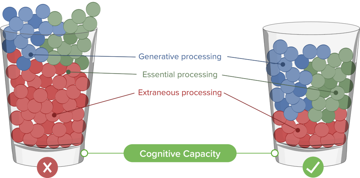
No matter how important the content may be, the capacity of learners to retain ideas from a single presentation is limited. The amount of information a learner can process as they select, organize, and integrate the ideas in a presentation relates to the cognitive load, which includes Essential, Extraneous, and Generative cognitive processing. Essential cognitive processing is required for the learner to create a cognitive representation of necessary and relevant information. This is the desired part of processing but should be managed to not overload the cognitive process. Extraneous processing refers to cognitive processing that does not contribute to learning and is often caused by poor design. Extraneous processing should be eliminated whenever possible to free up cognitive resources. Generative cognitive processing gives meaning to the material and creates deep learning. Learners must be motivated to engage and understand the information for this type of processing to occur.
Foundations in neuroscience
What we know about cognition and learning has been supported and informed by research in neuroscience (4). Neuroscience advances have also allowed us to gain deeper understanding into cognitive science principles, including those on multimedia learning. Researchers have been increasingly tracking learner eye movements to study learners’ attention and interest as a method of validating the impact of multimedia principles, and the results have supported the benefits of proper multimedia design on learner performance (5). Another avenue of research with great potential includes functional MRI (fMRI) readings or electroencephalography (EEG) (6). It has long been established that verbal and pictorial data is processed in different parts of the brain. More recently however, by examining changes in blood flow in different regions of the brain, researchers in Sweden were able to demonstrate that increased extraneous load could impact the effectiveness of learning, in line with the dual channel principle (7).
Evidence for effective presentations
Mayer’s Multimedia Principles
Mayer’s Multimedia Principles.
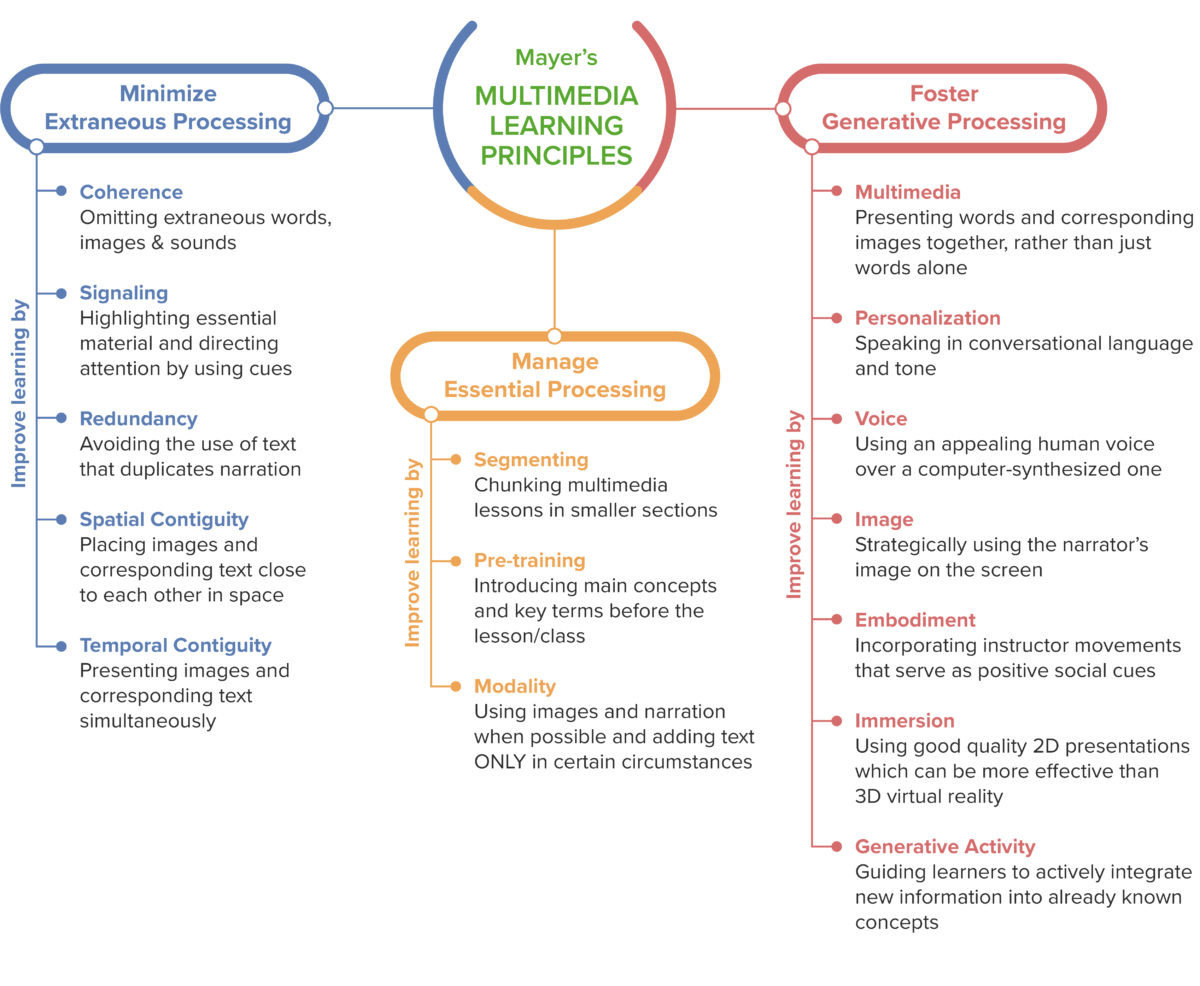
Mayer’s multimedia principles are a set of evidence-based guidelines for producing multimedia based on facilitating essential processing, reducing extraneous processing, and promoting generative processing (8). Mayer’s list of principles often includes fifteen principles, some of which have changed over time, and in a study conducted with medical students, the following nine principles were found to be particularly effective (3). The first three of these principles are used to reduce extraneous processing.
Principles for reducing extraneous processing:
- Coherence principle: eliminate extraneous material
- Signaling principle: highlight essential material
- Spatial contiguity principle: place printed words near corresponding graphics
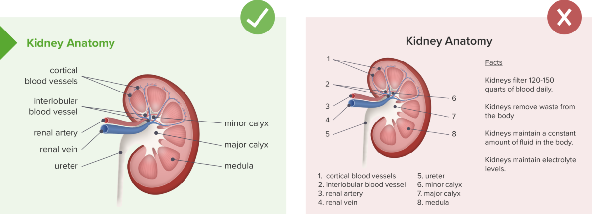
To illustrate these principles, we will use a lesson about the kidneys. The instructor wants to make diagrams of the anatomy to use during discussion. The coherence principle says to only include the information necessary to the lesson. Graphics such as clip art, information that does not relate to anatomy, or unnecessary music reduces cognitive capacity. The signaling principle says to highlight essential material; this might include putting important content in bold or larger font. Or, if the kidney is shown in situ, the rest of the anatomy may be shown in grayscale or a much lighter color to de-emphasize it. The spatial contiguity principle says to place printed words, such as the labels, near the graphics.
Reduce extraneous processing.
Do: keep labels next to diagrams, use only essential material, highlight essential material such as titles.
Don’t: separate labels from diagrams, include extra facts, or have excessive text on a slide, especially with no indication of what is most important.
Principles for managing essential processing:
- Pre-training principle: provide pre-training in names and characteristics of key concepts
- Segmenting principle: break lessons into learner-controlled segments
- Modality principle: present words in spoken form
The next three principles are used to manage essential processing. If the kidney lesson moves into diseased states or diagnostics, the pre-training principle says that learners should be given information on any unfamiliar terminology before the lesson begins. To satisfy the segmenting principle, the learner should be able to control each piece of the lesson. For example, a “next” button may allow them to progress from pre-training to anatomy to diseased states and then diagnostics. The modality principle says that words should be spoken when possible. Voice-over can be used and text can be limited to essential material such as key definitions or lists.
Manage essential processing.
Do: Present terms and key concepts first, break lessons into user-controlled segments, and present words in spoken form.
Don’t: Give long blocks of text for students to read without priming students for key concepts.
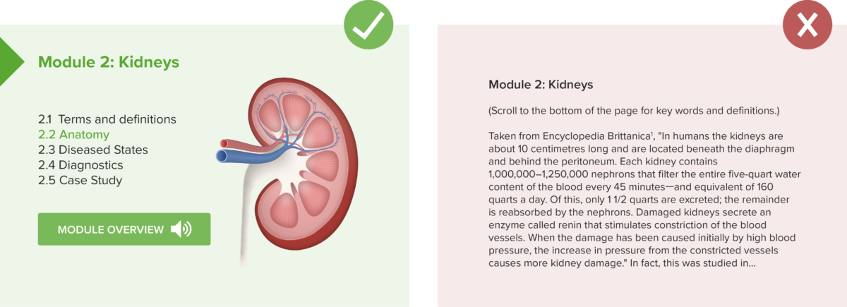
Principles for fostering generative processing:
- Multimedia principle: present words and pictures rather than words alone
- Personalization principle: present words in conversational or polite style
- Voice principle: use a human voice rather than a machine voice
Mayer’s work also includes principles to increase generative processing. The multimedia principle is a direct result of the dual channel principle and limited capacity principle. Words and pictures together stimulate both channels and allow the memory to process more information than words alone. To adhere to the personalization principle to promote deeper learning, a case study is better presented as a story than a page of diagnostics and patient demographics. Finally, the voice principle says that a human voice is more desirable, so it is better to use the instructor’s voice when doing voice-overs rather than auto-generated readers.
Foster generative processing.
Do: Present words and pictures, present words in conversational style, and use a human voice.
Don’t: Present text only, present words as a list of facts or overly technical language, or use a computer-generated voice.

Additional multimedia principles:
- Temporal contiguity principle: present words and pictures simultaneously rather than successively
- Redundancy principle: for a fast paced lesson, people learn better from graphics and narration rather than graphics, narration, and text
- Image principle: people do not learn better if a static image of the instructor is added to the presentation
Additional principles include the temporal contiguity principle, which states that words and pictures should be shown simultaneously rather than successively. This also includes narration and images or animation. For example, if an animation demonstrates normal cell division, the narration should be given during the animation, not after. The redundancy principle states that people do not necessarily learn better if text is added to graphics and narration. The duplication of information creates extraneous processing as learners try to process print and spoken text. The image principle states that learners do not learn better if a static image of the instructor is added to a presentation. For example, if students are watching an animation with normal cell division, they do not learn better if an image of their instructor is placed next to the animation.
Additional principles for fostering generative processing:
- Embodiment principle: onscreen instructors should display high embodiment not low
- Immersion principle: 3D virtual reality is not necessarily better than 2D presentations
- Generative activity principle: use generative learning activities during learning
In the newest edition of Mayer’s Multimedia Learning (8), three additional principles have been added. The embodiment principle states that onscreen instructors should display high embodiment rather than low embodiment, meaning they should use natural gestures, look at the camera as if making eye contact, and if drawing, show the image being drawn. If demonstrating something like a surgical procedure, a first-person perspective should be used so the learner sees the perspective of the person performing. Low embodiment would include standing still, lack of eye contact, and using a third-person perspective. The immersion principle states that 3D immersive virtual reality is not necessarily more effective than 2D presentations, such as on a computer screen. This is thought to be caused by the cognitive load on the learning involved in using 3D immersive technology but more studies are needed. Lastly, the generative activity principle states that learners should use generative learning activities while learning such as summarizing, mapping, drawing, imagining, self-testing, self-explaining, teaching, and enacting. These activities help learners cognitively select and organize new material and then integrate with prior knowledge.
Other Design Principles
Mayer’s design principles are functional but do not address aesthetics per se. Anyone can master the basic graphic design principles as discussed by Reynolds (9) to captivate and engage an audience.
- Create graphics that are designed for the back of the room. Whatever the venue, the person in the back needs to be able to see and gather information from the graphics. Ensure font size is appropriate, image size and clarity is sufficient, and that font type and spacing allow words to be seen clearly from a distance. For online materials, this principle may mean designing for the person who will be viewing on the smallest screen (such as a phone) rather than assuming viewers will use a large monitor (10).
- Limit the types of fonts. Too many fonts or fonts that don’t coordinate well can make graphics seem jarring and unpleasant. Some programs will suggest font families that are appealing, and a safe guideline is to limit to two or three fonts maximum per graphic.
- Use contrasting colors. Colors that are too similar or using type on top of images that lack contrast can make type difficult to read. Color family suggestions can be found online or in software such as Powerpoint.
Graphic design principles.
Do: Use coordinating fonts and color schemes with contrasting colors.
Don’t: use multiple fonts, excessive colors, and/or non-contrasting colors that may be difficult to distinguish.

In addition to singular graphics or presentations, online course presentation makes a difference in how learners perceive and utilize a course. When designing online learning experiences, consider using guidelines such as Quality Matters to assess the functionality. Quality Matters rubrics look at key components that have been proven to facilitate learning by making navigation and presentation of course elements explicit. Key components include providing information on how to get started, including learning objectives, allowing learners to track their progress, and using learning activities and technology tools that support active learning. Navigation among course components should facilitate access to materials.
In addition to all of these principles, accessibility must be considered in all forms of presentation. In education, designing for accessibility can be guided by universal design principles. Some schools may even require all courses and materials to be fully accessible. Providing accessible options has been shown to benefit all learners, not just those with a documented need for accommodations (11). Some basic accommodations that should be offered in any class include offering media in multiple modes. For example, videos should have the option of captioning and/or access to a transcript, and photos and graphics should have captions that describe the image. Many learning management systems and software programs now have options to check for accessibility. Additionally, most schools can provide assistance in assessing and developing accessible materials.
Practical Applications for Presentations in Health Professions Education
Implementation in the classroom
When planning how to present materials in the classroom, first consider the most effective form of presentation for the given information. It may be a Powerpoint, a video, a graphic, or a handout. Consider using a variety of media appropriate for the intended outcomes. Creating high quality materials may seem daunting, but quality content can be reused, shared, and has been shown to enhance student learning.
Powerpoint has been much maligned for overuse and abuse, but well-designed presentations can be remarkably effective (12). When designing in Powerpoint, limit the amount of text per slide. One rule to remember is the 5/5/5 rule: Use no more than 5 lines of text with 5 words each or 5 text-heavy slides in a row and try to avoid bullets (13). Graphics are preferable to text or tables when representing data, but graphs and labels should be kept as simple as possible using 2D graphics and simplified labels that are easy for viewers to see (14). When presenting, refrain from reading from the slides. Slides should highlight important concepts and provide visual aids, not present everything. In addition, keep Powerpoint and video presentations short; most listeners will lose attention in 6–10 minutes (15,16). Whenever possible, engage the audience by interspersing active learning elements. Between sections or topics, transition slides can be used to indicate pauses for activity or reflection or to cue students to changes in topic (14).
When planning a presentation, consider presenting some of the information online before class for students to review. This flipped classroom technique allows for more class to be spent using active learning and facilitates the presentation of multiple forms of media and accessible options.
Implementation online
Videos often become an integral part of the online learning experience. To facilitate learning, consider the following tips for your own video production (17,18):
- Align the video with learning objectives and course outcomes. Focus on pertinent instructional points to reduce extraneous processing and thereby reduce cognitive load.
- Limit the length of videos and use interactive elements to promote active learning. To help maintain student engagement and deepen learning, include interactive elements such as discussions, quizzes or embedded questions to maintain student attention.
- Limit extraneous information, graphics, and sounds that do not pertain to the learning goals (19). Busy backgrounds, music, or animations that don’t contribute to understanding concepts unnecessarily add to a learner’s cognitive load.
- When using existing videos, ensure the source is reliable and the video is high quality. Video production can take time, so using professional videos can be beneficial if they come from credible sources that target the learning objectives with up-to-date and accurate information.
Additionally, Schooley et al. (18) have proposed a 25-item quality checklist that can help educators create and curate high-quality videos. Many of the items in the checklist have been discussed here such as length, captioning, using relevant graphics, and self-assessment opportunities, but also included are other points an educator should consider, such as the offering learners the ability to download files and adjust playback speed as well as providing them with recommendations for further reading.
For a course in any modality, creating and curating content online can save time and facilitate student learning. As you consider what material to create and use for your courses, assess existing material using the guidelines above to determine if it could be made more beneficial to learners. Does it follow Mayer’s principles? Does it follow graphic design principles and universal design principles? Consider using a Quality Matters rubric to check the course design for best practices.
Recommendations
Educator’s perspective
- Use Mayer’s multimedia design principles to revise existing presentations and review new creations for simple changes that can make a big difference (12).
- When delivering a presentation, start by discussing an unusual case, presenting an interesting story or an unexpected statistic, or explain how the topic impacts the listeners. This personalization will help gain their attention from the start (13).
- When designing your own materials and graphics, “less is more” is often a good guideline: limit the amount of information on slides, limit the types of fonts, and limit the excessive use of colors (9,12).
- Videos should be limited to 5–6 minutes when possible and avoid exceeding 10 minutes. Break up longer videos and intersperse interactive elements to keep students engaged (15–17).
- When using technology and online delivery, universal design and accessibility considerations can be complicated. See if your school has an expert that can review your materials to ensure all students will benefit.
Student perspective
- When creating presentations, reports, and charts, follow Mayer’s multimedia design principles to ensure your audience gets the most from your presentation.
- Avoid copy/pasting but rather try and present concepts in an original way in order to augment your understanding of the material.
- When looking at materials online, look for options such as captioning, transcripts, or audio buttons for accessing additional media output.
- If a presentation is lengthy, pause and insert your own activities to help yourself stay focused. Taking notes, pausing for reflection, and self-quizzing can help deepen your learning and keep your mind from wandering.
- If a variety of media aren’t offered, consider finding your own to supplement your learning. Credible sources with learning objectives that align with your course can augment your learning experience.
Self-quiz
(Please select all that apply)
1. When creating a graphic about the current status of heart disease in the US, which of the following would align with best practices?
a. Gaining the audience’s attention with a picture of your dog.
b. Using 3 colors that coordinate well on a contrasting background.
c. A 2D graph with simple labels rather than a table of data.
d. An image on the left with labels listed separately on the right.
e. An image next to a paragraph of text that you will read for the audience.
2. Which of the following are true about educational videos?
a. They need to be created by professionals to be high-quality.
b. They should be less than 10 minutes.
c. There should be an option for closed captioning or a written transcript.
d. Longer videos may be used but should be broken up with active learning elements.
e. Videos don’t need to align to objectives as long as they’re well-made.
3. Which of the following would be examples of Mayer’s multimedia principles?
a. Using a human voice rather than a machine voice.
b. Using formal language instead of conversational language.
c. Playing soothing music in the background of a video.
d. Providing new words and definitions before the presentation begins.
e. Putting important words in bold for emphasis.
4. Which of these would follow best practices for online content?
a. Creating a module where all the material is on one page for easy access.
b. Adding buttons for next, back, and table of contents options for students to navigate.
c. Breaking material into 7-minute videos with practice questions between them.
d. Adding fun clip art and cool images to the pages even if it doesn’t directly relate to the content.
e. Having text only because images are distracting.
Answers: (1) b,c. (2) b,c,d. (3) a,d,e. (4) b,c.
Online Seminar
This online seminar and its accompanying article will focus on the topic of Effective Presentations, which have a set of key qualities: they are appealing, engaging, informative, and concise. Effective presentations gain attention and captivate the audience, but most importantly, they convey information and ideas memorably and efficiently. Using evidence-based principles in educational multimedia can ensure the development of high-quality learning experiences. Our host, Dr. Peter Horneffer will be sharing with us some key multimedia concepts that can help facilitate the development and implementation of effective multimedia into the educational process.
Watch the seminar recording:
Would you like to learn more? Explore the Pulse Seminar Library.
